
COLLINA VIOLA
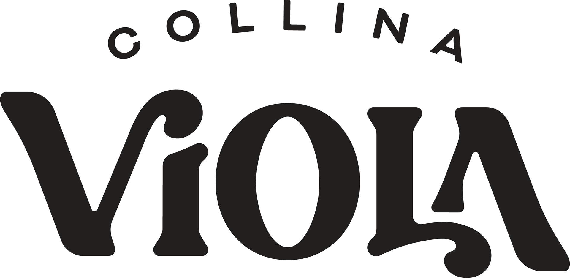
Collina Viola started as a passion project in a Brooklyn kitchen and is quickly emerging as a distinctive name in the aperitivo spirits category. The company requested a logo with a botanical theme. Their specific requirements included emphasizing "VIOLA" more prominently than "COLLINA," shaping the word "COLLINA" to resemble a hill, and avoiding any additional imagery.
DELIVERY
For this logo, I designed the letters in "VIOLA" to intertwine, mimicking the natural growth of plants. I also created the letters with soft, rounded edges to maintain the organic feel. Since "VIOLA" is large and custom, I chose a premade font for "COLLINA" to ensure versatility across print and digital materials.
TOOLS USED
ADOBE ILLUSTRATOR
ADOBE ILLUSTRATOR
INDUSTRY
FOOD AND BEVERAGE
FOOD AND BEVERAGE
YEAR CREATED
FEBURAY 2025
FEBURAY 2025

POSSIBLE AMBIGRAM VERSION
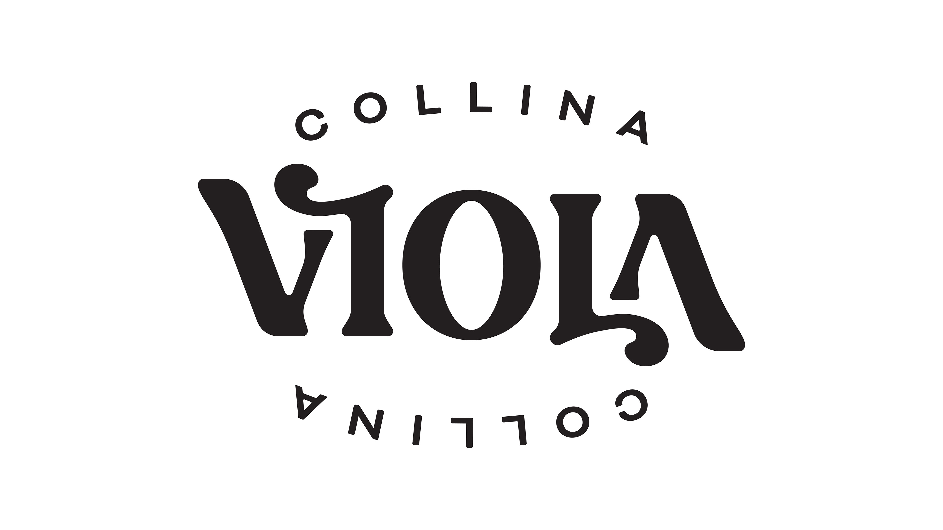
Before the company finalized the logo, the CEO expressed interest in the idea of using an ambigram. The word “VIOLA” was a perfect candidate. I started by centering the letter “O.” Then, I removed the crossbar from the “A” so it could resemble a “V” when flipped. Finally, I mirrored the “L” to create the letter “I.
TOOLS USED
ADOBE ILLUSTRATOR
ADOBE ILLUSTRATOR
INDUSTRY
FOOD AND BEVERAGE
FOOD AND BEVERAGE
YEAR CREATED
JANURARY 2025
JANURARY 2025