
COLLINA VIOLA
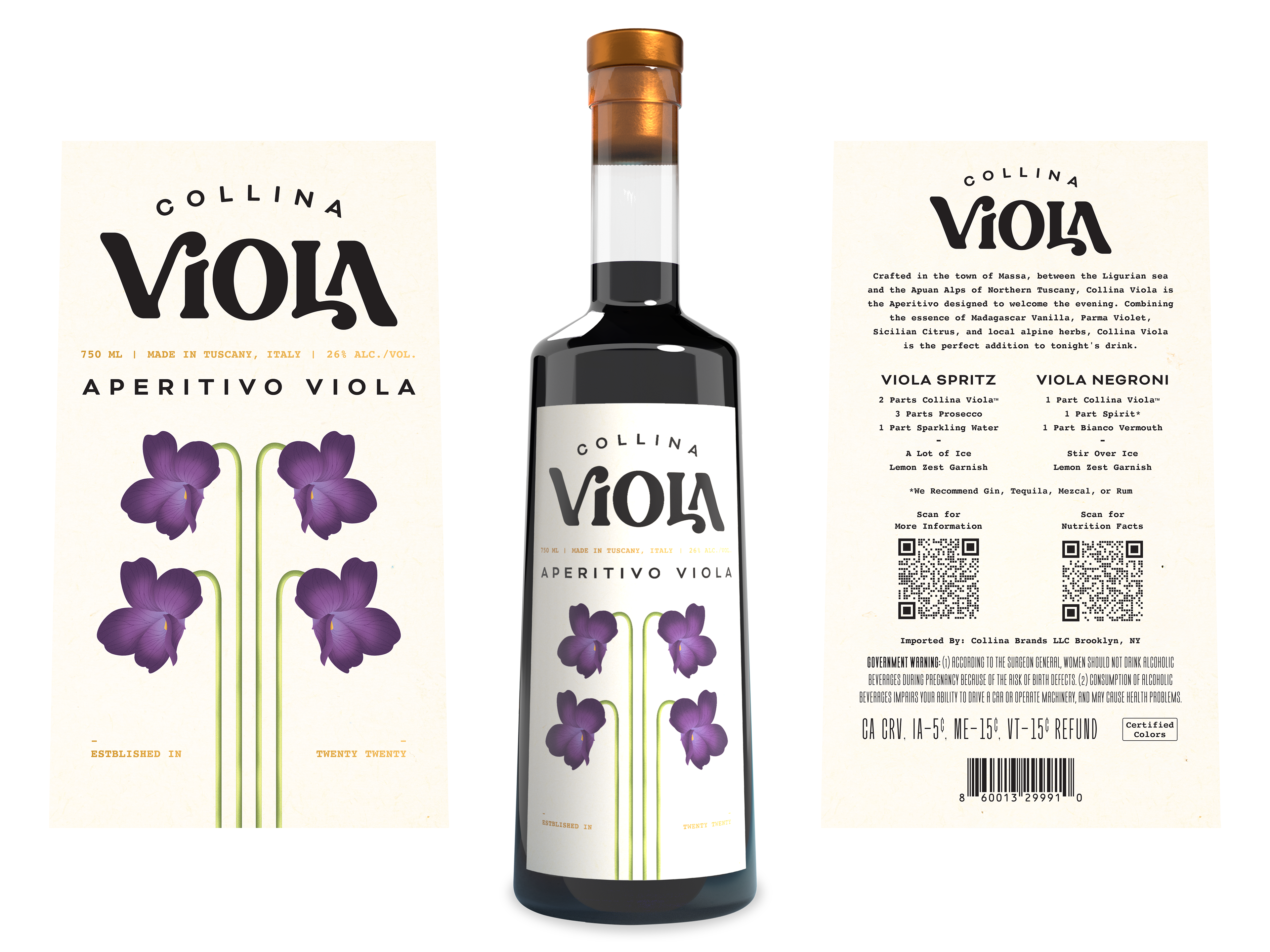
Collina Viola began as a passion project in a Brooklyn kitchen and is on its way to becoming the next standout among apertivo spirits. Named after the founder’s daughter, Viola, and featuring a distinctive purple hue, the brand sought to create a label highlighting violet elements with a boho-botanical aesthetic to mimic the floral flavor profile. The goal was to ensure that when customers are searching for a new aperitivo, Collina Viola is the first brand that comes to mind.
DELIVERY:
For this design, I chose a symmetrical layout that blends realism with simplicity. The violets were illustrated with detailed textures and shading to ensure they are immediately recognizable as violet flowers, reinforcing the product’s key botanical ingredient. A cream-colored background was selected to create strong contrast, allowing the violet elements to stand out. To ensure clarity and brand recognition, the logo and product name were rendered in black, making it easy for consumers to quickly identify it as Aperitivo Viola from Collina Viola.
TOOLS USED
ADOBE ILLUSTATOR
ADOBE PHOTOSHOP
ADOBE DIMENSION
ADOBE ILLUSTATOR
ADOBE PHOTOSHOP
ADOBE DIMENSION
INDUSTRY
FOOD AND BEVERAGE
FOOD AND BEVERAGE
YEAR CREATED
MARCH 2025
MARCH 2025